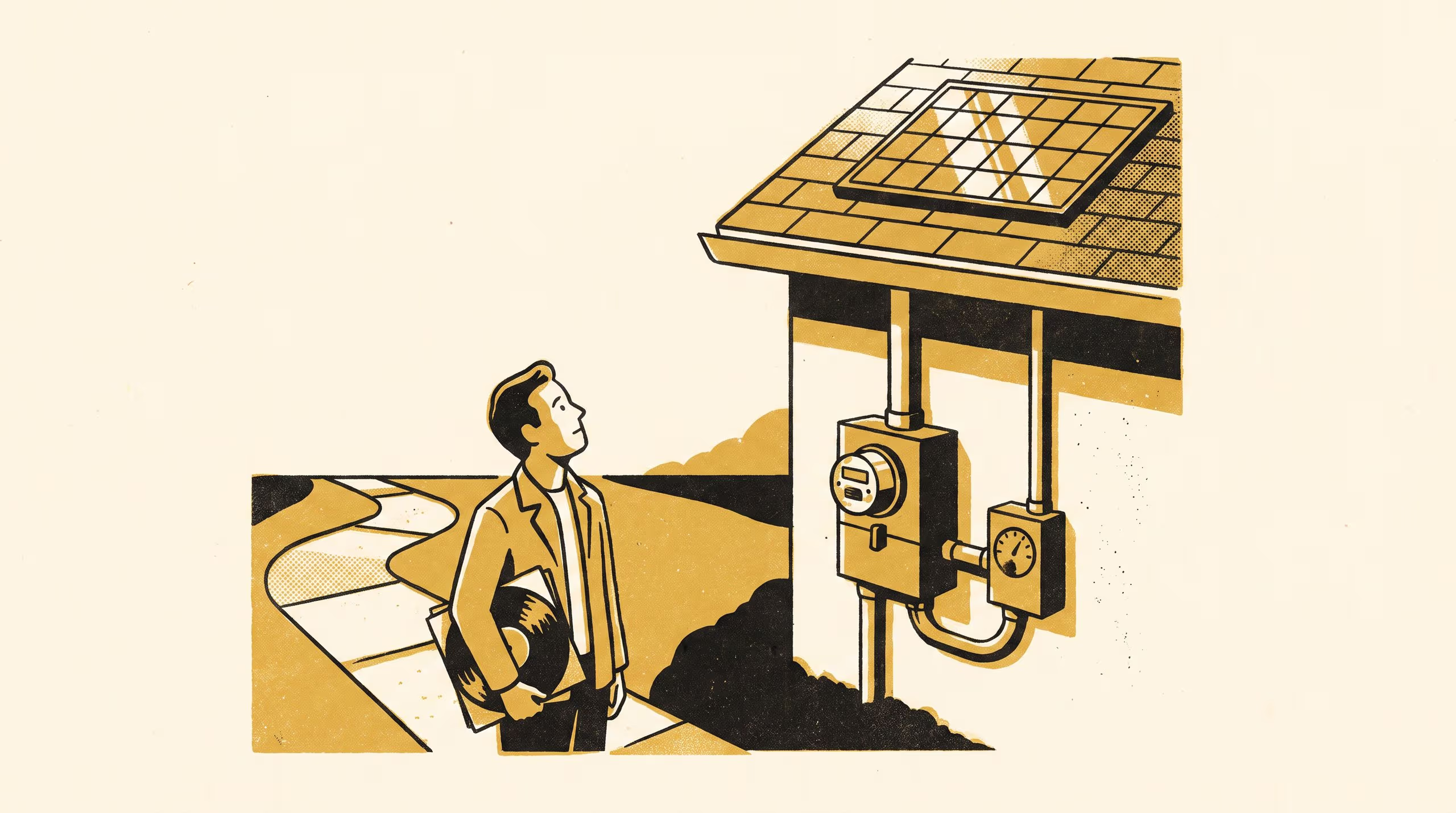
A five-year Impact Report pairs a home solar app's daily self-sufficiency score against an independently metered grid draw, finding the gap widens most the week daylight saving begins.
Five years pairing a home solar app's self-sufficiency figure against an independently metered grid draw, widest apart the week daylight saving begins
A rooftop solar system’s daily self-sufficiency figure reads like a simple ratio: energy drawn from the sun, divided by energy drawn altogether. The School of Continuous Improvement’s newest Impact Report spent five years checking whether the ratio a household sees is the ratio a household actually lives.
Five years of comparing a household’s own dashboard against an instrument nobody else was watching taught us as much about attention as it did about electricity.
— Associate Professor Casimir Beng, Lead, Adaptive Metrics Lab
The report pairs daily solar-app scores from 1,240 households against an independently calibrated meter fitted at each grid connection point, the two readings run side by side for five years across four impact areas. The figures track closely on an ordinary Tuesday and pull furthest apart the week daylight saving begins, when the app’s own midnight boundary quietly double-counts or drops an hour of import and export. A companion finding traces when households actually check the score, and shows the moments of closest attention landing on the moments the figure is least settled.
Partway through the review period the School turned its own standing audit format on the comparison itself. “Running the same review on our own instrument that we’d run on anyone else’s was never going to be comfortable, and it wasn’t meant to be,” said Dr Bram Ntuli, Lecturer and Convenor, Improvement Grand Rounds.
The School applies the same discipline to its own instrument that it expects of everyone else’s: say what the number can support, and no more.
The full report is available from the University’s research repository under an open licence, doi:10.5555/slop.laat50.