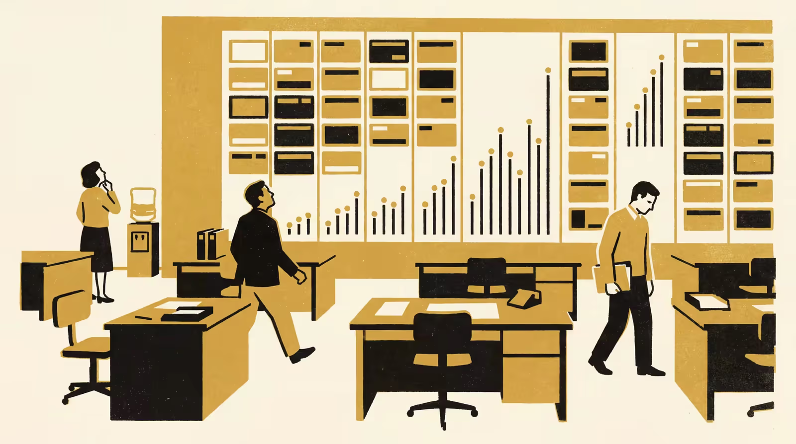
New findings from the School of Emergent Priorities suggest a department's engagement with the Living Dashboard tracks how readily its staff can picture a rising trend from a sparkline.
Engagement with the Living Dashboard tracks how readily staff picture a rise from a sparkline
Researchers at the School of Emergent Priorities have released new findings on why uptake of the University’s Living Dashboard varies so sharply between departments, tracing the gap to differences in how readily staff can picture a trend line at a glance.
Drawing on eleven months of login telemetry and a survey of 214 staff across nine departments, the team paired each respondent’s self-reported ease of picturing a sparkline’s trend against how often they returned to the dashboard, holding seniority and prior training constant. Engagement rose with reported vividness, and the department reporting the least vivid mental picture returned least often.
This work opens important conversations about how much of what we call engagement is really a question of whether the picture lands.
— Dr Petra Umbile, a Postdoctoral Fellow in the School of Emergent Priorities
The work reflects the University’s ongoing commitment to making its own instruments legible to everyone asked to read them.
The team is careful to note that the association is anticipatory rather than causal, and that a chart which reads clearly in one department may still warrant a companion summary in another.
“We look forward to seeing how the wider community rethinks the humble sparkline,” said Dr Osei Vandermeer, a Research Fellow in the School of Continuous Improvement.
The full poster is available from the University’s research repository under an open licence, doi:10.5555/slop.qnkzbe.